The Cutscenes
Hello, it's Phoebe! I'm here to talk about the development of the cutscene art.
Let's start with the first frame of the beginning cutscene as an example.
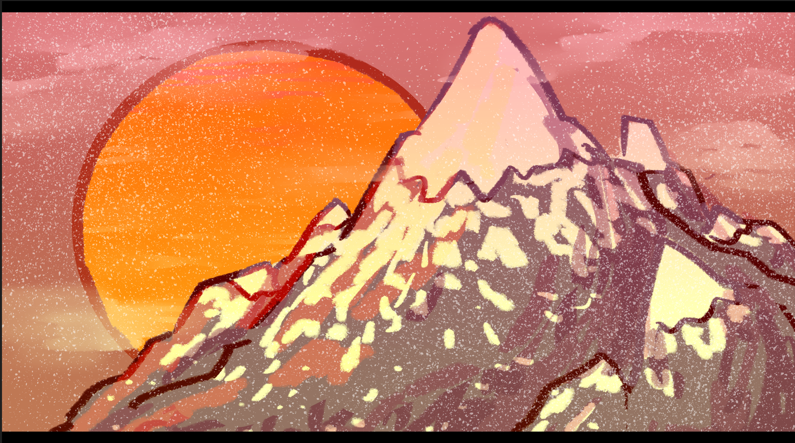
With the limited timeframe of our game, I couldn't go and make every frame in the cutscene be perfect works of art. However, using color theory and various filters an effects, I could give a good illusion of a detailed frame. Without the effects or color correction, the frame actually boils down to something very simple.
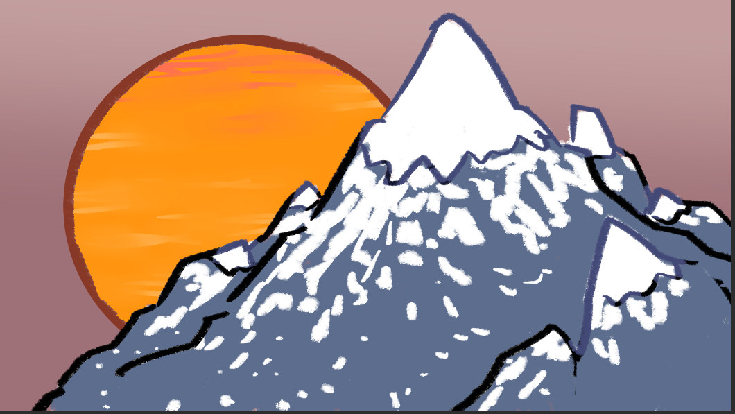
As I began making the ending cutscene, however, I started getting a little more ambitious with my backgrounds and effects. If you watch the two cutscenes side-by-side, it becomes very apparent. For example, this frame right here:
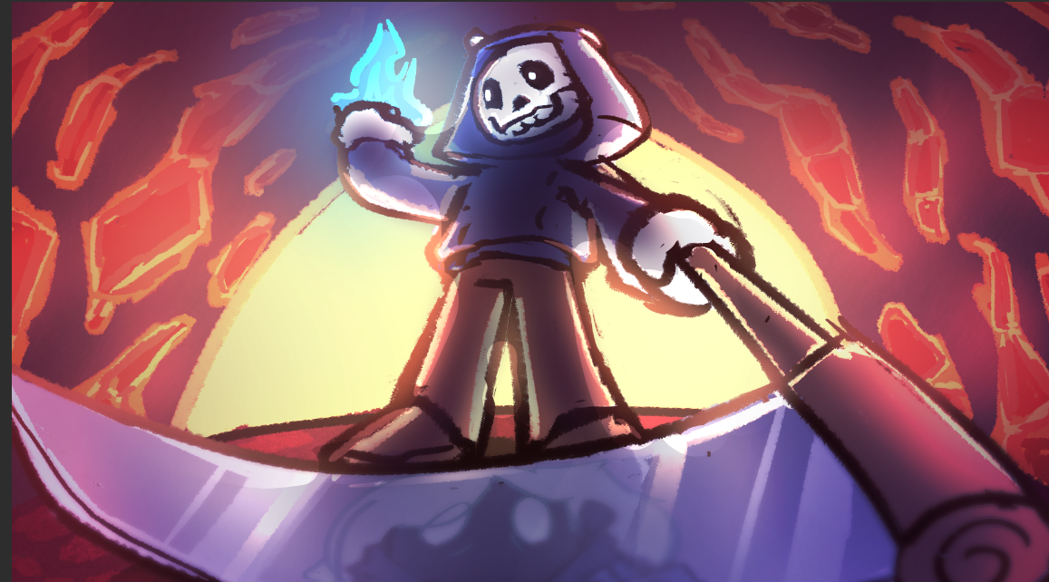
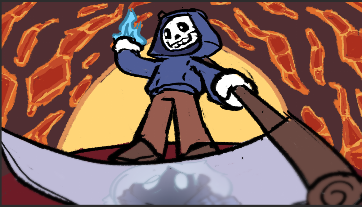
This frame follows the same basic principles of using color that the previous frame does, but there's two big differences: The perspective, and the scythe. The scythe actually does have some very detailed shading on it, and the perspective really lets the player see that in full effect.
The add(glow) effect in Clip Studio Paint, where I made these frames, really pulled its wait here. They are what make the glow effect on the reaper. and the scythe. It's most apparent when you take away all the effects and jut compare the base colors to the finished frame.
I also edited all the cutscenes together in Clip as well, and adding sound effects really enhanced their effect. The biggest problem I've run into is that the cutscene sounds in Clip end up being either way louder or way more quiet then they actually end up exporting as. So, I plan on doing some audio correction once I have the time. It's been really fun working on these, and I've gotten a lot of good practice with lighting and perspective.
Get Shade's Summit
Shade's Summit
| Status | In development |
| Authors | Shades summit, GaryWestSide, asauer97, Alice V, MysLooni |
More posts
- Shade's Peak - AIJul 30, 2024
- The End GameJul 22, 2024
- The Soul ResourceJul 01, 2024
- Shade's Peak - Projectiles Part 1Jun 25, 2024
- Shades Summit Level DesignJun 17, 2024
- Shade's DesignJun 10, 2024

Leave a comment
Log in with itch.io to leave a comment.